October 10, 2024, 10:38 am | Read time: 3 minutes
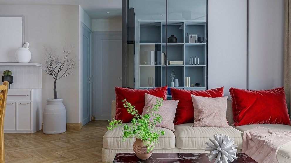
The days of boring beige, taupe, or cream are over – at least in part. That’s because the rather monotonous furnishings are now accentuated with a bright red.
Red is not just a trend color in the interior world in 2024. Last year, the signal color already appeared more and more frequently in the home. But unlike in the past, red is now showing its bright side. Because instead of soft nuances, it is now becoming strong. The so-called “Unexpected Red Theory” has been going viral for several months now and is gradually finding its way into our homes.
What’s behind the “Unexpected Red Theory”
The “Unexpected Red Theory” was created by New York interior designer Taylor Migliazzo Simon. In a Tiktok video, which has now been clicked on over a million times, she declares red to be the ultimate color in interiors.
In her opinion, every room looks better immediately when you integrate something red. This includes small items such as candlesticks, cushions, or picture frames – but also chests of drawers, lamps, or oversized works of art. Contrary to expectations, the color red goes well in any room and with any other color. The reason is that, like red lipstick, the color attracts everyone’s attention in a room. This allows you to emphasize certain areas and let others fade into the background. Taylor Migliazzo Simon even goes so far as to say that since red always goes well, it should be used as a neutral tone.
Red in combination with light blue, violet, and salmon
What has been floating around on social media for months is now gradually finding its way into our homes. And it’s okay to be bold. Because the color is by no means only combined with soft beige tones.
The combination of bright red and light blue is particularly eye-catching. Both the red and the blue take center stage and harmonize surprisingly well. The combination is refreshing and modern and can be used in numerous interior styles.
In addition to light blue, a bright pink or, even better, pink is the ideal partner for a strong red. It looks particularly harmonious when the pink takes the bigger part – for example, a pink sofa with red cushions. Or a pink shelf with a red table lamp. If you combine pink and red, the proportion can be 50/50. However, a soft shade of salmon, which almost looks like a light, faded red, is also an ideal match for the intense color trend.
The brave can also try a combination of red and violet. What is actually considered out of the question is suddenly harmonious. If you want to approach this duet slowly for the time being, you can choose a red candlestick with a purple candle or vice versa.

Interior Designer Reveals These Are the Decorating Trends for Spring 2025

Interior Designer Showcases 6 decorative trends for fall 2024 that will make it cozy

Inspiration Designer reveals the interior trends for 2025
Setting the right focus
If you want to bring the trend color red into your home, you should pay attention to what you want to focus on. Do you want the sideboard to attract more attention? Then perhaps a red table lamp or coffee table books in a strong shade of red would suit. If you prefer the eye to wander through the whole room and focus less on one piece, then you should opt for several red accents. A red picture frame, a red wooden chair, and red paint – that’s it.

